Hello,
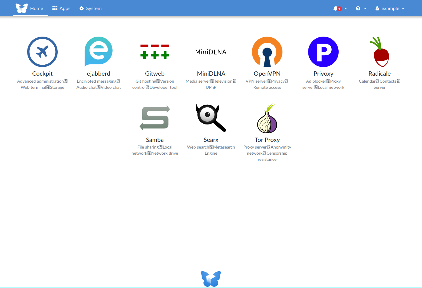
While checking my FreedomBox’s home page, I noticed a potential issue with the footer layout. Specifically, the “FreedomBox Powered” logo in the footer appears to be cut off. This seems to happen when there are two rows of apps displayed, combined with the current CSS rule for the footer, which includes a generously sized padding-top.
footer {
    text-align: center;
    padding-top: 20rem;
}
Below is a screenshot that illustrates the issue:
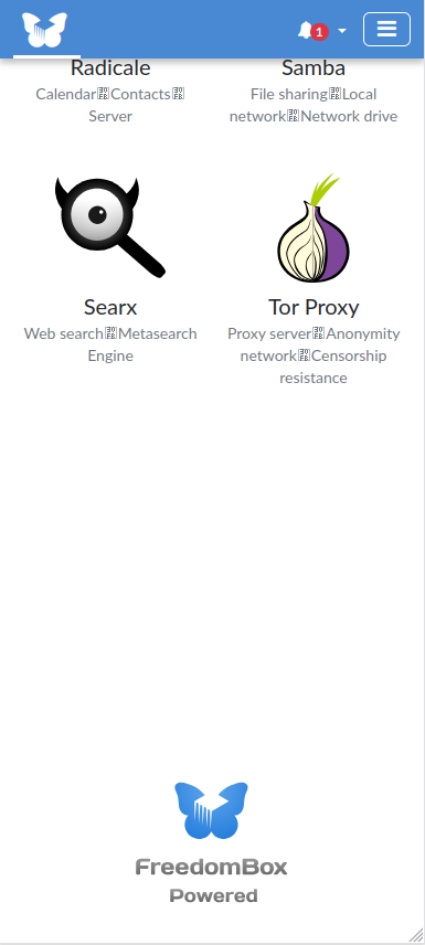
I also noticed that the footer feels a bit off on mobile devices, as shown here:
I experimented with the padding-top value and found that replacing it with 10vh (or even 15vh) leads to a more balanced look compared to the current 20rem.
Alternatively, a more responsive approach could be implemented to adjust the padding dynamically based on the screen size. Another possibility might be relocating the “FreedomBox Powered” logo entirely, perhaps placing it in a less space-constrained area.
Of course, these are just personal observations and suggestions for potential improvement. I understand that this might not be considered a high-priority issue since it’s largely about aesthetics. Still, I wanted to share my experience and offer a couple of ideas to contribute positively to the project.