Thanks to @Sunil we now have the ability to change the css styles of fbx as of version 24.25.
More here; FreedomBox/Customization - Debian Wiki
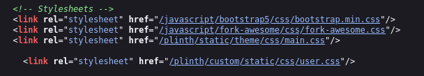
That page says to Create a file in the path /var/www/plinth/custom/static/css/user.css
However, I only had /var/www/ so I had to create the subfolders of www and then create user.css
Creating that user.css adds the relevant stylesheet link below the other three and since it’s last, any css you add to user.css will override the css in the others.
This all started with a thread by @Ged asking about a dark theme back in Jun 2023, before I even had a fbx. I found the thread last Nov and brought it back to life as I was wanting a dark theme as well. I have a dark mode browser extension but it doesn’t work well with Plinth. I also have a Custom CSS extension but it goes by domain so it affected the fbx apps as well.
At some point in the thread, I came up with the idea for a user.css(not my original idea) and Sunil made it a reality so now we can all style fbx to our liking, whether it’s a dark theme or simply changing the header from blue to something else or increasing the font sizes for accessibility purposes.
Some FYI stuff;
Like most large css frameworks, bootstrap uses css variables and the css gets compiled from those variables using SASS or LESS css compilers. Below is an example of css variables.
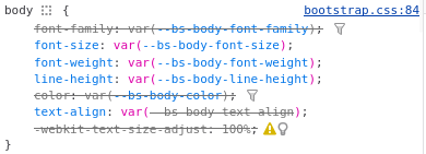
No worries, to change the body font size for paragraph text, var(--bs-body-font-size} can be overridden with something like this 18px so in the end, you end up with body { font-size: 18px; }
Technically, the proper method would be to change the .sass or .less file and recompile bootstrap.css but that won’t work for us. Tweaking and overriding individual styles is what we can do and it’s much easier anyway
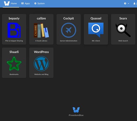
My Dark Theme
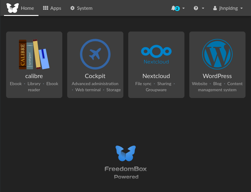
I had started fiddling around with making a dark theme in the other thread and was making the app cards dark but decided against it due to so many of them having black or other dark color for the icons. The icons are png files with a transparent background so this is what I ended up with.
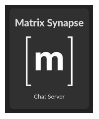
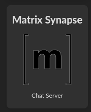
The Matrix App looked especially bad
I ended up going with a light/medium gray card background color.
Here’s a system page - Users and Groups
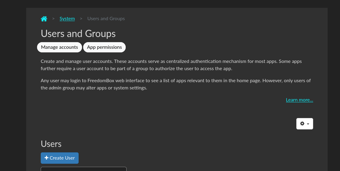
Users list without actually showing the world my users’ names
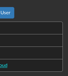
As you can see, I changed the color of links to turquoise because the default blue was blurry on the dark backgrounds.
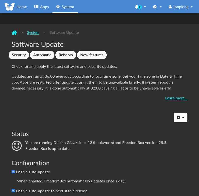
Updates Page
The user.css only effects Plinth and not any of the apps and some of them are already dark or have a dark mode option like NextCloud or in the case of WordPress, a gazillion themes are available including some with a dark mode button for your visitors to choose.
Below is my user.css with comments (which seems to break code syntax highlighting)
/**** Change to Light Font Color on Dark Page Background ****/
body {
  color: #DCDCDC;
  background: #222222;
}

/**** Change links From Blue to Turquoise for Readability ****/
a {
  color: #0df2fd;
}

/**** Lighten Table Font Color ****/
.table > :not(caption) > * > * {
  color: #b9b9b9;
}

/**** Lighten Table Font Color ****/
.table {
  --bs-table-color: #b9b9b9;
}

/**** Darken Containers ****/
.content-container {
  background-color: #303030;
}

/**** Darken Notification Font Color ****/
.notification-info, .notification-debug {
  color: #222;
}

/**** Darken Users List on Users Page ****/
.list-group {
  --bs-list-group-bg: #222222;
}

/**** Lighten Users List Items Borders ****/
.list-group-item {
  border: var(--bs-list-group-border-width) solid #959595;
  }

/**** Darken Help Block Font Color ****/
.help-block {
  color: #dcdcdc;
}

/**** Cards are the Apps Blocks with Logos ****/
.card {
  margin: 0.5rem;
  background-color: #ddd;
}

/**** Set App Description Font Color ****/
.card-description {
  color: #DCDCDC;
}

/**** Set App Title Font Color ****/
.card-title {
  color: #282828;
}
CSS without comments(with syntax highlighting)
body {
  color: #DCDCDC; background: #222222;
}

a {
  color: #0df2fd;
}

.table > :not(caption) > * > * {
  color: #b9b9b9;
}

.table {
  --bs-table-color: #b9b9b9;
}

.content-container {
  background-color: #303030;
}

.notification-info, .notification-debug {
  color: #222;
}

.list-group {
  --bs-list-group-bg: #222222;
}

.list-group-item {
  border: var(--bs-list-group-border-width) solid #959595;
  }

.help-block {
  color: #dcdcdc;
}

.card {
  margin: 0.5rem;
  background-color: #ddd;
}

.card-description {
  color: #DCDCDC;
}

.card-title {
  color: #282828;
}
and the CSS minified to save a whopping 500 bytes in file size
body{color:#DCDCDC;background:#222222}a{color:#0df2fd}.table > :not(caption) > * > *{color:#b9b9b9}.table{--bs-table-color:#b9b9b9}.content-container{background-color:#303030}.notification-debug,.notification-info{color:#222}.list-group{--bs-list-group-bg:#222222}.list-group-item{border:var(--bs-list-group-border-width) solid #959595}.help-block{color:#dcdcdc}.card{margin:0.5rem;background-color:#ddd}.card-description{color:#DCDCDC}.card-title{color:#282828}
and my favorite, one per line, almost as small as minified but more readable
body {color: #DCDCDC; background: #222222;}
a {color: #0df2fd;}
.table > :not(caption) > * > * {color: #b9b9b9;}
.table {--bs-table-color: #b9b9b9;}
.content-container {background-color: #303030;}
.notification-info, .notification-debug {color: #222;}
.list-group {--bs-list-group-bg: #222222;}
.list-group-item {border: var(--bs-list-group-border-width) solid #959595;}
.help-block {color: #dcdcdc;}
.card {margin: 0.5rem; background-color: #ddd;}
.card-description {color: #DCDCDC;}
.card-title {color: #282828;}
If you need some inspiration for color tweaks, bootswatch has a bunch of bootstrap themes and is handy because it has bootstrap html elements like card.
More FYI stuff
Using the browser’s dev tool, Inspect, is the best way to try things out temporarily. You can tweak the css on the fly only in the browser. There are various ways to open the Inspect tool but the way I usually do it is to hover over something on the page that I want to look at the styles of, Right Click and then click Inspect.
Here’s a good 10 minute run down on that(using Chrome I think) - https://www.youtube.com/watch?v=oRKlKhFt2Rg
W3schools is a good place to learn html and css
One thing the 10 minute Inspect video didn’t cover was playing with colors which is pretty much all I did with my css. Here’s a 1 minute silent video showing how it’s done using the Inspect color tools - https://www.youtube.com/watch?v=6tR1u7UxmgU - it loaded as a 360p version for me so I had to click the gear to change it to 1080p. It shows changing the search button on google to an ugly pink with white text.
If you know what colors you want, maybe from bootswatch, you can also just type over the existing css in Inspect. That’s shown in the 10 minute video for font-size but the same can be done for colors.
Also, while it’s a little finicky, you can copy the css from the Inspector or DOM. Highlighting it is the tricky part but once it’s highlighted,Ctrl+C or right click and copy. That way if you’ve tweaked a color, font-size, margin etc and like it, you can copy it and paste into user.css.
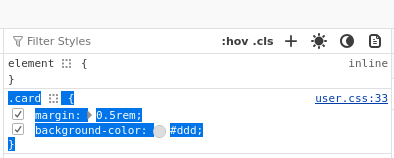
The hard part of highlighting the above is getting in front of the dot before card so it’s easier to swipe up from the bottom, after that last curly brace.
That’s it
If anyone needs help, it would be best to send me a PM as I’m not on here much. I do get an email notification of a PM here and my email client auto-starts when my PC starts. You can also ask here as I’m sure many members know html/css.
Happy Theming!