RFC: Tags for apps

Summary
Apps in FreedomBox are all in one uncategorized list. This makes it hard for users to find similar apps, alternatives and what all purposes an app can be used for.

People have been asking for app categories to serve this purpose. This proposal suggests using tags instead.

Assumptions
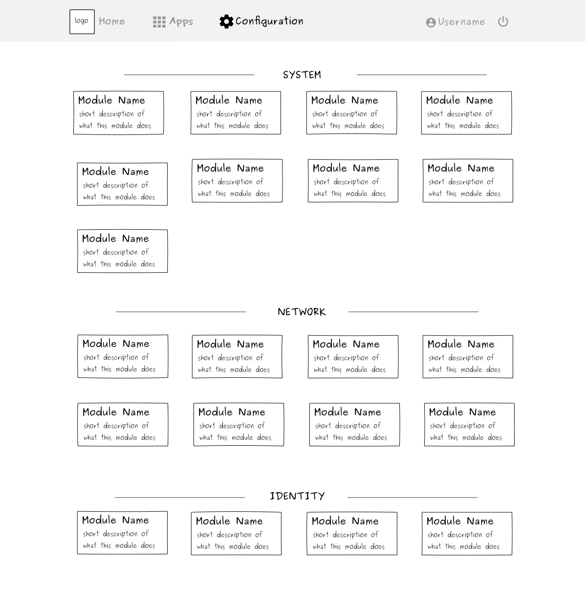
Only tags for Apps page is discussed. It is assumed that the System page will never grow big enough to need tags.

Problem
Apps in FreedomBox are all in one uncategorized list. This makes it hard for users to find similar apps, alternatives and what all purposes an app can be used for. Unfortunately, apps have multiple purposes and do not neatly fit into categories e.g. Ikiwiki can be put under any of three categories - wiki, blogging, forums.

Solution

Flat is better than nested.
– The Zen of Python

Each app can have a set of descriptive tags.
Multiple apps with the same tag implicitly fall under the same category.

bit-torrent - Deluge, Transmission
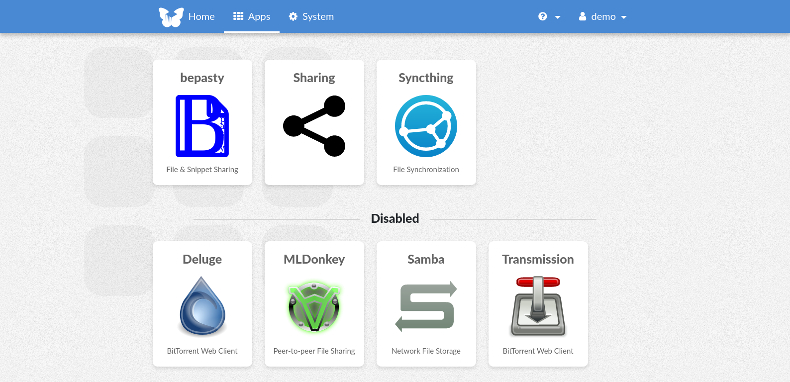
file-sharing - Sharing, Syncthing, Samba, Bepasty, Deluge, Transmission …

Clicking on a tag reveals all the apps in its category.
e.g. Clicking on bit-torrent takes the user to /plinth/apps/tagged/bit-torrent which filters the apps in the apps page to reveal only Deluge and Transmission.

If we have a search feature, tags can be shown as suggestions in a drop-down while searching.

Screenshots/Layouts

URL: https://demo.freedombox.org/plinth/apps/tagged/file-sharing

Alternatives
Apps can be classified into categories instead of using tags. This can be implemented in two ways:

  1. Each app belongs to one category only
  2. An app can be placed into multiple categories

The first option puts an app in one category only. Users will not discover the other uses for the app easily. It is also hard to put some multi-purpose apps under a single category.

The second option seems better, but it overpopulates the apps page with duplicate apps in multiple categories. This also confuses users when trying to decide which app to install in a category.

Tasks

  • Manifests of apps have an optional list of tags which are displayed in app pages
  • Clicking on a tag shows a page with all apps under the category

Implementation
Since the number of apps is small, a first implementation can maintain an in-memory map of tag => list of apps. A KV store might be required when we reach thousands of apps.

Extension
Since each tag is a set of apps, one might think of implementing union, intersection and subtraction of sets. We can think of implementing these advanced features if there is need.

Caveats
Reuse of tags should be encouraged. Using overly specific tag names (e.g. binary-pastebin) will lead to a proliferation of tags. One tag corresponding to one app only will defeat the purpose.

2 Likes

I like this approach. Besides finding apps, it also provides a few words that describes at a glance what the app is about. It could mitigate the need for rating the apps (https://salsa.debian.org/freedombox-team/freedombox/-/issues/933). For example, an app with the “decentralization” tag obviously would have a strong focus on decentralization.

One minor suggestion for the filtered apps view: add a label above the apps to show the tag that is being filtered, along with an X that removes the filter.

1 Like

I also think the tags can be very good for the apps.

I also agree that, as you wrote, the system configuration page won’t need tags to limit the scope.

Yet, if there is no easier way already available, maybe the same tagging properties could also be (creatively) used to get a good structure (group and sort) for the items on the System (->Configuration) page [issue #1226], i.e. tagging with single categories and precedence values, and listing the items on the “Configuration” page according to category and precedence, without any user adjustable tag filtering.

Tags are meant for discoverability.
Categories can be used for limiting scope but it would be bad in our case, since only one feature of an app can be highlighted by a category.

I don’t see the need for categories or tags for our currently small number (18/19) of System tiles which are unlikely to grow much (maybe shrink?). I don’t even want to spend effort designing a solution for the System page at this point.

Apps and System pages having a similar design is the result of how the backend is organized, but they don’t have to. Maybe we would come up with a different design for the System page in the future.

Same tagging mechanism for configs?

But that’s exaclty why I proposed to simply make use of the same tagging properties on the system page. (“Two birds with one stone.”) But only use them for one fixed, specific “category” dimension there (plus a tag to sort the listing order). Without showing any tags as visible labels to the users, there.

The current “System” page’s grid, with its block of 20 new icons, really is more of an obstacle than helping new users to find their way around in the configuring of their freedombox.

A much more accessible “Configuration” page could arise, simply by listing the icons in four expanded bootstrap collapsibles (just so that it can also work seamlessly on small screens):

System

  • fist config item A ( tagged: Sys, 100 )
  • second config item B ( tagged: Sys, 200 )

Network

  • first network item A ( tagged: Net, 100 )
  • second network item B ( tagged: Net, 200 )

…

This was the original mock-up from the configuration issue (second “bird” for your fine work on the tagging “stone”):

Totally agree, I think filters should be implemented and the default page should be only the most popular “app” for each service, so its straight forward for non-thechnical users. but the you would also have the option of showing all apps like it happends at the moment.

To illustrate: I helped a friend to set up a freedombox. Working through the “System” page, the eyes just went “um, what, now”. At the router page it was, “port forwading, ok there, under network, external”.