Summary
(A brief description of what the plan wishes to achieve and how.)
Problem
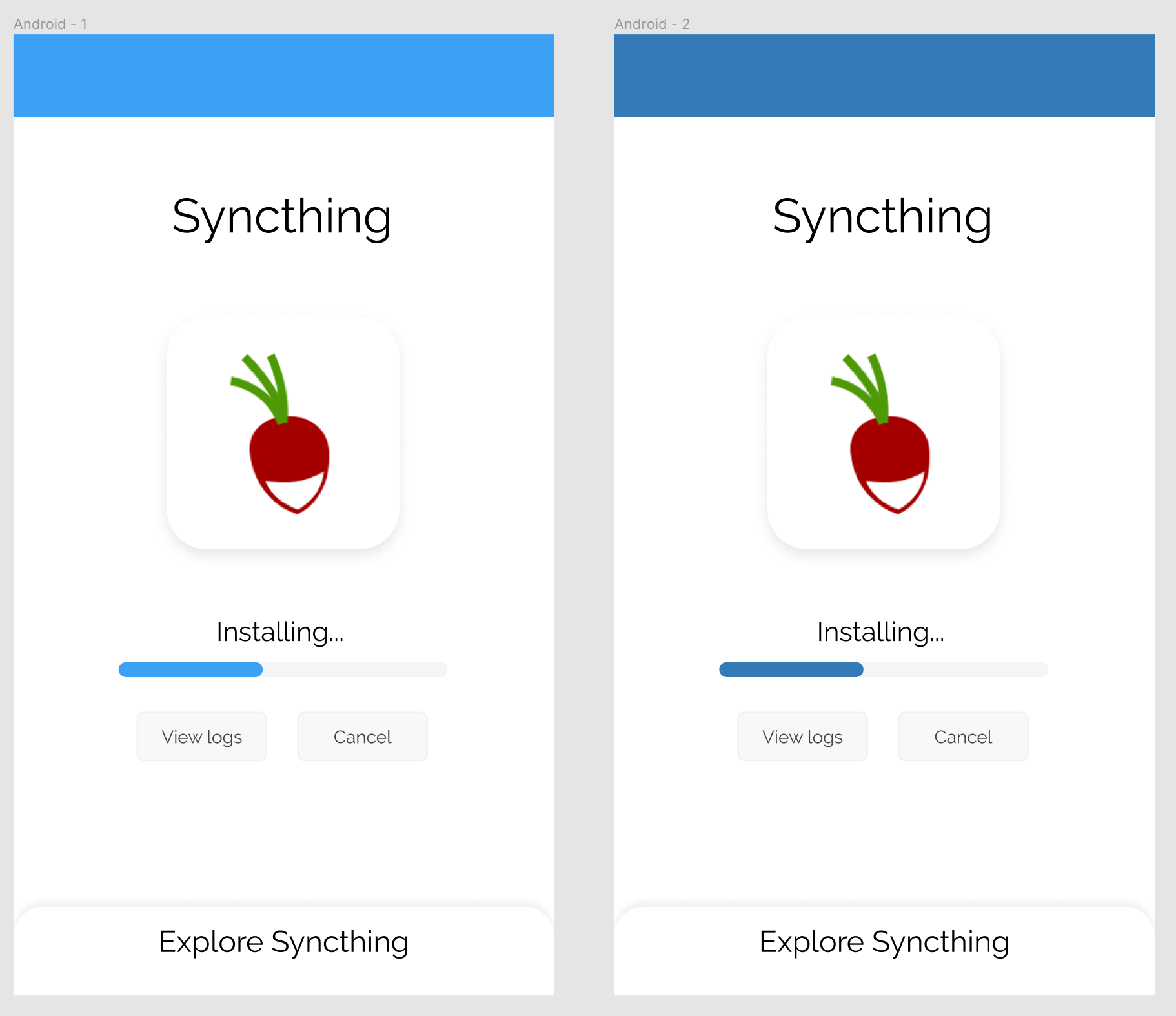
Currently the installation screen looks very dull and doesn’t really have a proper indication that something is being installed unless the user puts some effort. One mroe problem I see with this particular view is that if you think about it, a user would start off with reading about the application first and then install it, so it makes no sense to show any description about the application in the installation screen. It would make more sense to make installation the “focal point” in the installation screen. We can then have a small pull-out card that renders the application guide for the user so they can go through it while the installation continues.
Screenshots/Layouts
So now if we think about it, we have this following user flow:
- User clicks on the app icon in apps page
- User reads the intro description of the app, and decides to install it.
- Installation starts, the installation screen appears indicating the live installation status (can be done via webrtc/websockets and js… or just the plain auto old refresh is also enough as a fallback)
- The user can view live installation logs or cancell the installation
- The user can also pull the card just at the bottom of the installation screen up, doing so will bring up a card with everything about the app aka the application guide.
- The user can then proceed to read more about how to setup and use the application as the installation continues
Do tell me what you all think about this idea!